My very first house

I have already posted about this semester’s project before. Here is updated version and the final status!

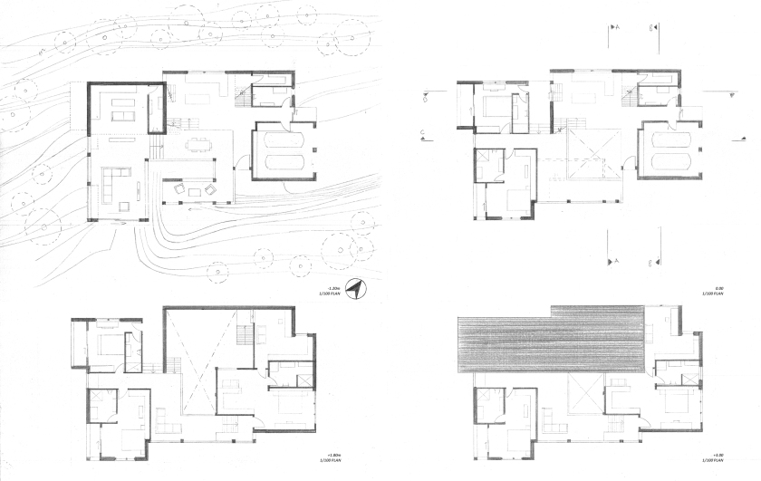
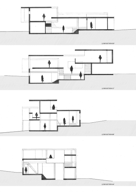
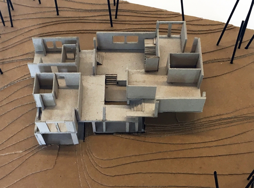
My proposal is strongly based on Adolf Loos’ idea of spatial plan commonly known as Raumplan to a degree. The plan has several stepped levels and room sequences that are all visually or physically connected, and there are spaces at each level with different functions.

raumplanH
Raumplan House, Spain, 2015, Alberto Campo Baeza.

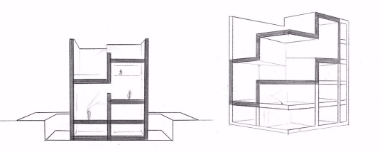
I refer to a particular house which a version of Raumplan is employed. It is Raumplan House, Spain, 2015, Alberto Campo Baeza. This house has three spiraling and diagonal interconnected spaces. I wanted to reinterpret this triple in my proposal since it provides anyone to see other two spaces exactly by standing in one, and anyone can able to see two different directions while standing in the middle space.

Also, the spaces are only visually connected and the level difference is high since the house has small site and needed to shaped vertically.  While adapting this three diagonal spaces to my house proposal, I have decided to decrease the level differences and provide access from one space to another.

Therefore, this is the way how spaces come together.

mobiush
Möbius House, Het Gooi, 1993-1998, UNStudio. Diagrams.

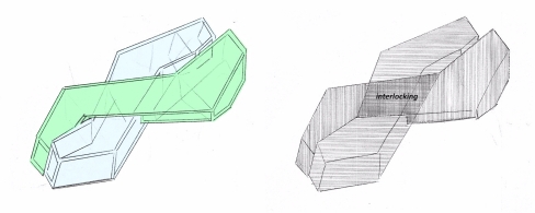
I have Möbius House as my second primary reference.

What I have learned about Möbius House is that there are two programmatic lines which are positioned side by side horizontally and they interlock in a specific part. This ‘bow tie’ like configuration of two programmatic lines, which has sequence of spaces inside, made me think that what if this two lines of Möbius House was designed with Raumplan?

raumplanH
Diagrams. *It is about combining two of these diagonal space organization by learning from Möbius House.

Then, unlike the original configuration of Möbius lines, in my proposal the lines combined vertically (on top of each other) because of the vertical space organization of Raumplan House.

axonometric
Exploded axonometric drawing of my house proposal.

After two lines started to position vertically I have reinterpreted the intersection part.

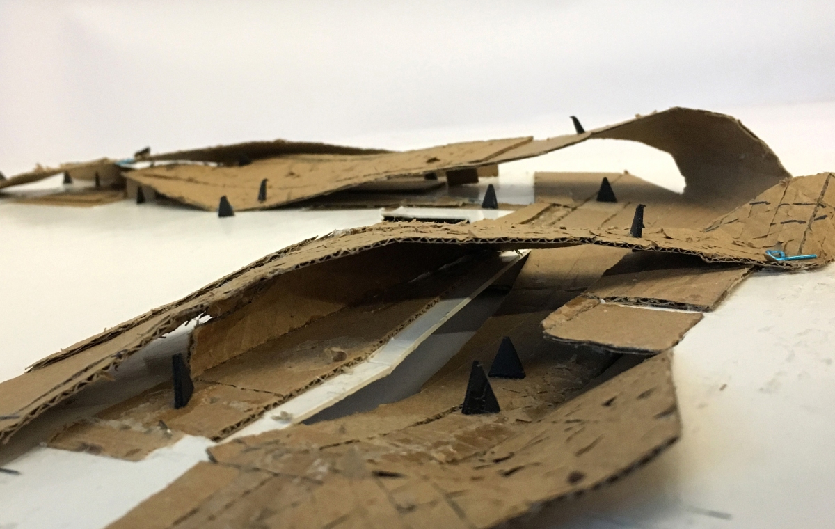
While Möbius House’s intersection part is dense, I have the exact opposite in my proposal. I designed it as a vertical void, as a vertically shared intersection part. Therefore, the form of levelling of this intersection part became different.

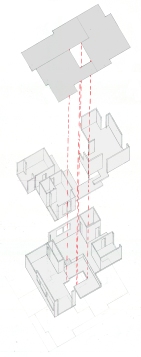
How I achieved this void?

Since I have two programmatic lines come from Raumplan. I planned that

One line has opening to this direction (kind of interior garden) while other opening has towards another direction. So, the different surface I designed below and the upper opening and the skylight act like this vertical shared intersection together.

sitehousek
House K., Germany, 2005, Titus Benhard. Site Plan.

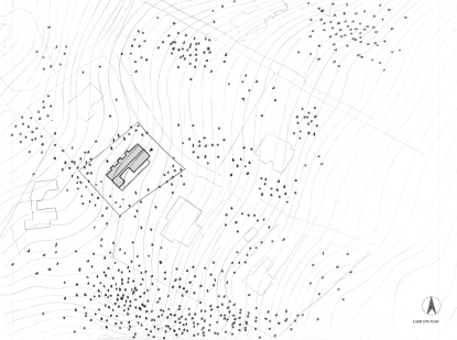
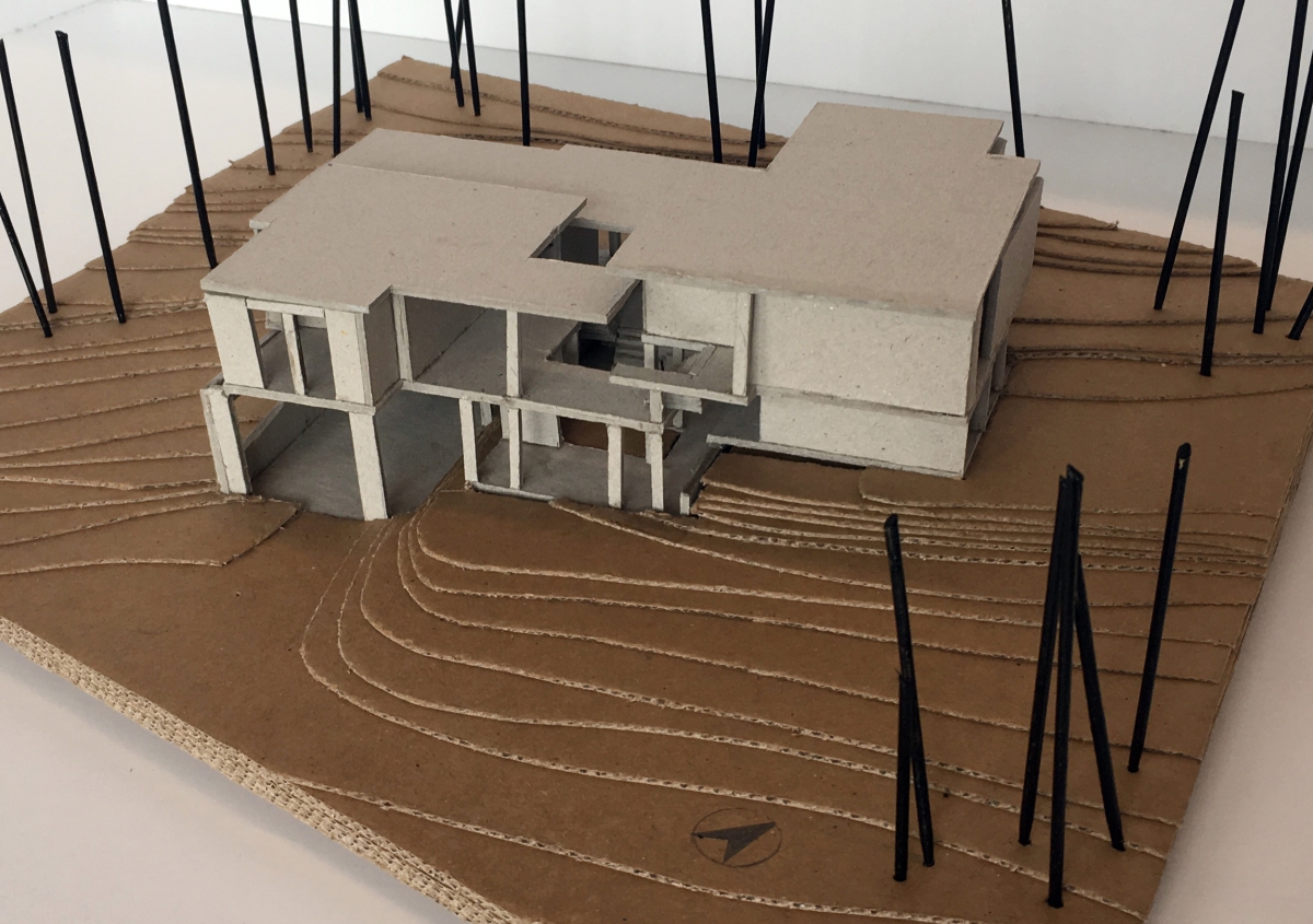
While continuing my research, I came across to a house called House K., Germany, 2005, Titus Benhard. The house is in a suburban place. Its site is quite elevated from the lake level approximately 61 meters, and the distance between lake and the house is 330 meters.

I wanted to refer to this house’s ‘zoning spaces’ approach and how this approach works with the site. The house has two parts as front and back with a long separator axis between them. While the stepped arrangement of the spaces in back is in part a response to the sloped nature of the site, the spaces in front especially open out towards lake. The lake is on south-east direction.

Considering these, I have decided to locate my house proposal on to the site of House K. and apply these back & front conditions to my proposal as bottom & top. Therefore, I designed the bottom line as an open space reaches from the entrance (kitchen) towards the front garden and decrease gradually over several split levels. This means , on one hand the bottom line follows the slope of terrain, has spaces which are directly related with garden, and has zones such as kitchen, living (big spaces). On the other hand, The top line open towards lake and establishes a hierarchical sequence of rooms. Spaces of that line face with lakei and has rooms which have same or similar functions such as private rooms, sleeping, robing, child room (middle spaces).

site plan
Site plan of My House proposal

IMG_5619
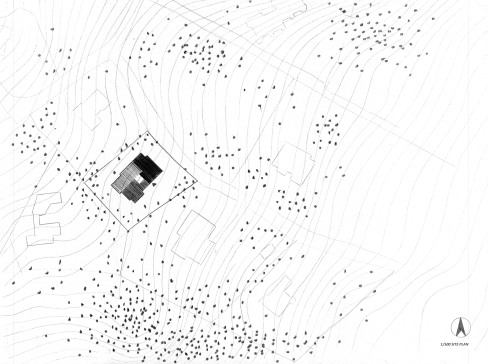
Other responses to the site: I changed the actual direction of North in order to provide better climate conditions and qualities to spaces. So, the house spreads east west direction and spaces face with south, southeast, southwest. There are spaces on the north direction such as studio, pantry, garage. Approach/access from road and main entrance are from northeast.

Secondary References: I refer to Möbius House’s kitchen and its positioning regarding the studio, garage, and storage places. The ceilings (upper slabs) of some bottom spaces became terraces to the upper spaces as in Möbius House. Further, the tectonic of my house proposal based on Möbius House’s materials: concrete + glass.

plans
Plan drawings of my house proposal.
sections
1/100 Section drawings.


#notes from “A Pattern Language”

Alexander, C. & Ishikawa, S. & Silverstein, M. (1977). A Pattern Language: Towns, Buildings, Construction. Oxford University Press, USA.

  • Nobody wants fast through (nonstop) traffic going by their homes.
  • How important it is to be in touch with water.
  • Each parking lot surrounded by garden walls, hedges, fences, slopes, trees so that from outside cars are almost invisible.
  • Place entrances and exits of the parking lots in such a way that they fit naturally into the pattern of pedestrian movement and lead directly, without confusion, to the major entrances to individual buildings.
  • An outdoor space is positive when it has a distinct and definite shape, as definite as the shape of a room. (Defined outer space!)
  • At present, people take for granted that it is possible to us indoor space which is lit by artificial light; and buildings therefore take on all kinds of shapes and depths.
  • Isolated buildings are symptoms of a disconnected sick society.
  • Try to form new building as continuations of the older buildings.
  • The shape of a buildings has a great effect on the relative degrees of privacy and overcrowding in it, and this in turn has a critical effect on people’s comfort and well-being. Long thin rectangles, branched shapes, tall narrow towers increase the separation between places inside the building and therefore increase the relative privacy people are able to get within a given area.
  • The entrance must be places in such a way that people who approach the building see the entrance or some hint of where entrance is, as soon as they see the building itself.
  • If a garden is too close to the street, people will not use it because it is not private enough. But if it is too far from the street, then it will not be used either, because it is too isolated. Do not place the garden fully in front of the house, nor fully to the back. Instead, place it in some kind of hall-way position, side-by-side with the house, in a position which is half hidden from the street and half-exposed. (Balance!).
  • You might create a transition by changing the texture of the path, so that you step off the sidewalk onto a grave path and then up a step or two and under trellis. (Make a transition space between the street and the front door). Bring the path which connects street and entrance through this transition space, and mark it with a change of light, a change of sound, a change of direction, a change of surface, a change of level, perhaps by gateways which make a change of enclosure, and above all with a change of view. (Approach!).
  • The entrance nearest the parking spot always becomes the “main” entrance, even if it was not planned that way. Secondary entrances: patio, garden door, teenager’s private entrance.
  • Place the parking place for the car and the main entrance, in such a relation to each other that the shortest route from the parked car into the house is always through the main entrance. Make the parking place for the car into an actual room which makes a positive and graceful place where the car stands, not just a gap in the terrain.
  • Lay out the spaces of a building so that they create a sequence which begins with the entrance and the most public parts of the building, then leads into the slightly more private areas, and finally to the most private domains.
  • If the rooms are facing south, a house is bright and sunny and cheerful. The building gets an orientation toward the south. The north facing shady back yards were used primarily for storing junk.
  • Always place the building to the north of the outdoor spaces that go with them, and keep the outdoor spaces to the south. Never leave a deep band of shade between the building and the sunny part of the outdoor. (A breakfast nook that looks directly into a garden which is sunny in the morning, a workshop that gets full southern exposure during the middle of the day.)
  • Place the most important rooms along the south edge of the building, and spread the building out along the east west axis. Arrange spaces along the south, southeast, and southwest of the building to capture the sun. For example; give the common area a full southern exposure, bedrooms southeast, porch southwest. For most climates, this means the shapes of the building elongated east-west.
  • As far as possible, avoid the use of corridors and passages. Instead, use public rooms and common rooms as rooms for movement and gathering. To do this, place the common rooms to form a chain, or loop, so that it becomes possible to walk from room to room – and so that private rooms open directly off these public rooms (generosity of movement). In every case, give this indoor circulation from room to room a feeling of great generosity, passing in a wide and ample loop around the house, with views of fires and great windows.
  • The passages are broad, sunlit, with seats in them, views into gardens, more or less continuous with rooms.
  • Treat the whole staircase as a room (or if it is outside, as a courtyard). Wide steps on bottom=people coming down the stairs become the part of the action in the room while they are on stair.
  • Create alternating areas of light and dark throughout the building to increase contrast.
  • Give those parts of the house where people sleep, an eastern orientation, so that they wake up with the sun and light.
  • Rooms which have “light on two sides”=two sided rooms (one sided rooms=uncomfortable). Locate each room so that it has outdoor space outside it on at least two sides, and then, place windows in these outdoor walls so that light falls into every room from more than one direction.
  • Make the north face of the building a cascade which slopes down to the ground, so that the sun which normally casts a long shadow to the north strikes the ground immediately besides the building.
  • On the first floor keep windows high enough to be private.
  • A house feels isolated from the nature around it, unless its floors are interleaved directly with the arch that is around the house. Connect the building to the earth around it by building a series of paths, terraces, steps around the edge. Place them deliberately to make the boundary ambiguous, so that it is impossible to say exactly where the building stops and earth begins.
  • Shape the nearby buildings in respond to trees, so that the trees themselves and the trees and buildings together form places which people can use.
  • Alcoves. Make small places at the edge of any common room. These alcoves should be large enough for two people to sit, chat or play and sometimes large enough to contain a desk or a table.
  • A building in which the ceiling heights are all the same is virtually incapable of making people comfortable. Raise the floor level with steps, instead of lowering the ceiling. Vary the ceiling height continuously throughout the building, especially between rooms which open into each other, so that the relative intimacy of different spaces can be felt. In particular, make ceilings high in rooms which are public or meant for large gatherings, and very low in rooms or alcoves for one or two people.
  • Amount of enclosure (half solid-half open). Right balance between open, flowing space and close cell-like space. No one room entirely closed. No space totally connected to another. Use combinations of columns, half-open walls, porches, indoor windows, sliding doors, low sills, French doors, sitting walls, and so on, to hit the right balance.
  • Anyone who has to work in noise, in offices with people all around, needs to be able to pause and refresh himself with quiet in a more natural situation (a beautiful case is the Cambridge: quiet court stretching down to the River Cam). To meet this need, we may conceive all buildings as having a front and back. If the front is given to the street life –cars, shopping paths, delivery- than the back can be reserved for quiet. Build a walk along this quiet back, far enough from the building so that it gets full sunlight, but protected from noise by walls and distance and buildings. If possible place the backs where there is water.
  • Make a clear distinction between 3 kinds of homes. Those on quiet backwaters (on twisting paths, these are themselves physically secluded). Those on busy streets (many people passing by all day long, these are relatively exposed to the passersby). Those that are more or less in between. The in between houses may then be located on the paths half-way between the other two.

So far…

I am reporting that I have abandoned the design I worked on so far!

I am only half-joking about this, but there are significant changes. Let’s look at the new ideas, how is the current state of design, and how was the second pre-jury.

As I get the last criticism before the jury, I was thinking about why I insist on working this project with rectangular forms. This doubts made me think that the project really needed to have curvilinear forms as it had on the climax of the design. You can review the previous step from here to clarify the idea.

Narration of up-to-date Project: In such a homogeneous place like Tuz Gölü, I have observed that visitors look for variation and changes. By considering this, I wanted to design something dynamic and something unexpected, which visitors do not expect to see on the lake. At this place, I used a form which acts like various architectural elements, which is able to carry itself, and which becomes a structure itself.

I grafted the condition visual continuity -there is situation we see further spaces from the beginning- among spaces from Göreme. The curvilinear forms were positioned to provide this visual continuity. So, the form and the what is grafted from Göreme could work together.

I wanted visitors to approach the design from the extension parts of design, because there are diversified experiences and given clues with curves about what will come out further. Thanks to this situation, when visitors arrive the climax, where the form be upside down, they will remember the clues I gave before.

About the tectonic of my design, in order to create such a twisted forms, the concrete will be a great choice. Also, the use of different textures of concrete, for instance making one surface of concrete polished and other one is mat, diversifies the visitors experience. Jury suggested that I can study this texture differention with concrete on a smaller scale by providing actual concrete or I can study it by using different kinds of molds.

Another thing Jury recommended me to try to have a better understanding of how such concrete surfaces structurally work. Design has curvilinear surfaces so the building system is not like a post-lintel system since they do not have vertical and horizontal structural elements. They all continuous structural elements but it has some parts that need to be stronger. Thickness change on concrete according to where the moment increase, provides both reinforce the structure and enrich the expression of this building.

The way I draw the things was found successful to a degree. However, in plan drawing, there is a wall which lead the continuity to interrupt. If I took a section from there, it could be seen if this wall is a problem or a  nice thing, Jury commented. Plus, the jury specified that they were expecting a site plan too because mine was not good enough.

As a general overview: Jury found the way I represent my project, in an orderly manner, well done, the language of the project is very impressive, and the composition is very rich. They told me that I am building a very strong structure which is not shy about anything so, it would be good if the heights increase a little.

Early Ottoman Architecture

Constantinople Becomes Istanbul: The Ottomans captured the Constantinople with the purpose of creating an Islamic Roman Empire under the leadership of Mehmet II, known as the Conqueror Fatih in 1453. A new name, Istanbul, took hold in the vernacular which come from the Greek phrase “to the city”.

  • In the city, in order to stimulate merchant activity, Fatih built the markets of Kapali Çarşi which had square bays capped with rounded, lead-covered domes. The bedestan, a fortified compound for luxury goods, was built taller in the middle of 3000 shops.
  • Fatih absorbed the cultural and technical innovations of Italy. His fortifications both before and after the siege of the capital showed the influence of Italian engineering.
  • He considered the majestic Hagia Sophia as his great prize and quickly converted the venerable Palatine church into a royal mosque, by adding a minaret. He, also, inserted a mihrab into its eastern apse.
  • He inspired by the great Byzantine church and he built a new mosque, the Fatih Cami, and an extensive imaret. It had three smaller rounded domes. Its two slender minarets stood at the front corners of the mosque and its small cupolas topped each bay of the court’s arcades, and ancient granite columns supported pointed arches. It occupied the center of a vast, perfectly square plaza. The barrel vaults of earlier Byzantine cisterns serves as the foundation for the terraced complex. Sets of eight madrasas, in perfect bilateral symmetry, served for the study of canonical law, or sharia.
  • In 1459, Fatih decided to move from his palace in the center of the city to a new one at the extreme tip of the peninsula, where the acropolis of the ancient Greek city of Byzantium once stood. The Topkapi Saray complex offered a more secluded residence, with fortified walls surrounding a hilly, wooded park. The sultan’s private realm appeared the antithesis of European palaces: willfully asymmetrical and more like a garden than a building. It was closer to a Chinese scholars’ garden than to the geometrically coordinated Italian palazzo. The most important political space in Topkapi was the Divan, or Council Hall. Behind the Divan lay the Harem.

Continue reading “Early Ottoman Architecture”

Inspirations

One suggestion led me to begin to design this term’s project over again. Since I had this decision,  I have been searching about how to use this curvilinear forms deservedly. I found some structures inspiring me. One of them is: Longchamp store stairs by Thomas Heatherwick (below). There is a curvilinear form which acts like both a staircase and a ceiling to a space. It fits the ish condition we worked on previously this semester. Note: The ish term was expressing the multipurpose of elements.

The other one: Le Galilee office buildings (above)It gave me an idea that I can use an element both as a wall and a ceiling by curling it up. So, I can literally say I have changed my mind and the design. The new one is about to come.

If you are interesting, you can also check the site on below to see the twisted buildings around the world. https://www.dezeen.com/tag/twisted-buildings/

Reference

First Attempt

On my first attempt to attain what is suggested in pre-jury, I produced the design you see above. By keeping the twisted form, that is found strong, constant, I worked on two extension ‘arms’ of the form. This twisted form is the climax point, which offers visitors different experience, during their circulation in the design. While approaching the climax from these two ‘arms’ there is visual continuity but the physical dispersionby introducing more than one way. Also, I did not want visitors to access the climax directly, I wanted them to experience the ‘arms’ then arrive there. However, there is still something I think negative; the arms are the identical to each other somehow. That is to say that as the arms disperse further from the climax, I introduced some angled forms and the experience of walking in high, then, I brought visitors to the end which has rectangular form in both arms.

1350-1500: Architecture in Renaissance Italy & Early Ottoman Architecture

Architecture in Renaissance Italy

The idea of “Renaissance”, at the same time, the movement to revive ancient Greco-Roman culture, grew naturally in 14th and 15th century Florence, Italy. Leaders of the Italian merchant republics educated their young as humanists, so that humanism spread to the arts and architecture by emulating the all’antica, ancient details from Greco-Roman culture. In Florence, beside the artists and architects copied antiquity, they were also impatient to discover the underlying principles of design to apply their models. There, architects discovered harmonious proportions which are linked the classical orders. Together with influences of humanism, new built palaces and churches changed the character of Italian cities and gave them a more uniform scale and geometric basis. Meantime, painters guided the perspective vision, a scientific mode of seeing that put all the parts in relation to whole. The emergence of perspective vision accompanied the development of the principal public space of Italian city.

During the 14th century, the wealthiest merchant families spent their collective resources for the construction of great civic projects, including the public palace (now called Palazzo Vecchio), the new cathedral of Santa Maria del Fiore (Duomo), the public grain marker of Or San Michele (later turned into a church), the city walls, and the bridges.

Most public works in late 14th century Florence, used rounded arches, symmetrical places bays, and harmonious proportions. Plus, the Florentines added a new way of seeing, treating buildings as freestanding objects in proportional scale.

Florence’s greatest civic project, the cathedral of Santa Maria del Fiore, constructed in 1296. It has a simple Gothic style with its quadripartite ribbed vaults spanning the nave and two side aisles. A few years later, its length of the nave was extended and its area was outlined for a huge octagonal dome over the crossing. The dome intended to surpass the domes of the rival cities of Pisa and Siena. In 1376, the commune wanted the dimensions of the cupola to be as wide as the Pantheon in Rome and nearly twice its height. The architect, Filippo Brunelleschi took charge of the project. He built the new dome without falsework (temporary framework structures used to support a building during its construction), and by contriving a structure that supported itself during the process of construction. Filippo Brunelleschi conserved the dome’s pointed arches and ribs from the Gothic program of a few generations earlier, he added several all’antica motifs to exterior. There were rounded tribunes placed between the octagonal apses. Each of these had five shell-capped niches were flanked by pairs of Corinthian half columns and they were demonstrating Brunelleschi’s familiarity with ancient monuments. So, the cupola were containing innovation from Gothic structure while also displaying new elements of the revival of ancient Roman style. Continue reading “1350-1500: Architecture in Renaissance Italy & Early Ottoman Architecture”